
© Universität Bremen
Allow Us to Introduce: The New University Corporate Design
How did the University of Bremen choose its new design?
The new University of Bremen design can be seen on the first flyers and brochures, as well as the website: A modern design with graphic imagery, flexibility in composition, and a refreshed logo are part of the corporate design. But why does the university even need a new look? And who decides that? Kristina Logemann and Friederike Moschner from the Administrative Unit for University Communication and Marketing talk to us about the process that went on behind the scenes and has given the university a makeover.
The last corporate design development took place around twenty years ago – a long time for a visual appearance, explains Kristina Logemann. “The old corporate design had nothing to do with the zeitgeist and the standards of modern communication. The design was created for analogue communication channels, such as print media, back then. Today, much of that works digitally.” The head of the Administrative Unit for University Communication and Marketing – in short KOMMA – initiated the corporate identity development process and a new corporate design together with the University Executive Board at the beginning of 2020. It was at that point in time that Friederike Moschner joined the team to coordinate the project.

© Harald Rehling / Universität Bremen
What Are Corporate Identity and Corporate Design?
The university is a place of education and knowledge yet it stands for much more, explains Friederike Moschner: “If you hear the word ‘university’, you have a specific picture in your head. University is also a brand that is characterized by outstanding teaching, extraordinary research, and tolerant and favorable coexistence. We wanted to further develop and sharpen the joint self-image and brand profile in the corporate identity process,” explains the marketing expert. It is the self-image that connects all university members that is called corporate identity by specialists in the field, in short CI. When the CI has been determined, it is succinctly summarized as a so-called brand essence. All of this forms the foundation for corporate design (CD) – thus the homogenous appearance.
And Why Do We Need it?
The university as a brand may sound strange at first, as the university doesn’t actually sell anything. Kristina Logemann knows why a state university needs to work on its identity and image: “On the one hand, it’s about the community feeling of all university members and homogenous communication with the outside world. On the other hand, a university must have a distinct profile and a high recognition factor in order to assert itself against national and international competition on the scientific landscape.”

© Harald Rehling / Universität Bremen
How Did the University Come to Choose its New Image?
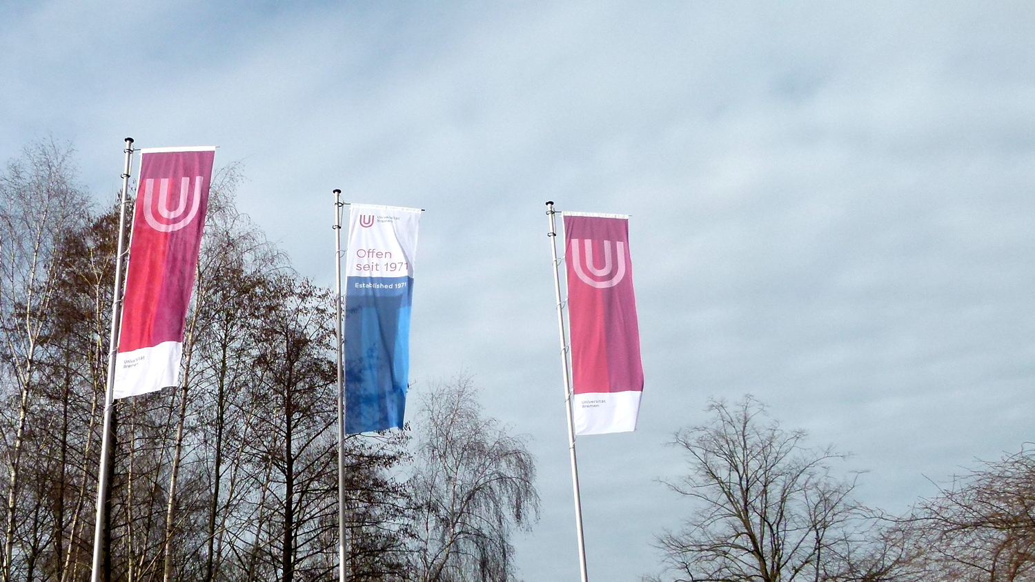
Before anything could be done to the design, work had to be carried out on the profile. “The people who work, research, and study at the university shape its image. That is why such a process cannot take place without them,” underscores Friederike Moschner. With the help of interviews, online surveys, and workshops, it was possible for the people who keep the university up and running to contribute: Administrative staff, researchers, professors, students, and University Executive Board members had the chance to describe the university from their perspective. “Together with external communication experts, we then formulated the identity of a young, dynamic, colorful, diverse, and international university based on the multifaceted input,” summarizes the marketing specialist with regard to the newly developed brand essence. All university members also had the opportunity to express themselves with regard to the new corporate design. That revealed a special surprise, Friederike Moschner remembers: “We found out that the majority of those asked were open to a change and further development of the logo. Said logo is now more minimal, concise, and as open as the university itself. By keeping the red U and the black typeface, the recognition value of the well-known brand is guaranteed.”

© Universität Bremen
Who Was Involved in the Decision-Making Process?
It is a lengthy and comprehensive development process. Thus, it is not possible to replicate every individual opinion in such a process, explains Friederike Moschner: “Together with the agency, we looked at all individual parts at the end and then created suggestions for the new CD based on them.” And in spite of all the pros and cons, a final decision had to be made: “After repeated and critical discussions surrounding the suggestions, the University Executive Board decided on the corporate design that we have now.”
Even if the new CD with the logo, various templates, and a refreshing of the website were introduced in January, a buffer until the end of the year has been planned for, tells us the marketing expert: “All areas should, however, be using the new corporate design by 2022 at the latest.”
Further Information:
Further information concerning the corporate design can be found on the website.
Please direct questions regarding the corporate design to marketing@uni-bremen.de.